24.11.2020News
Hassell’s visual identity by Studio Ongarato reflects evolution of architectural practice
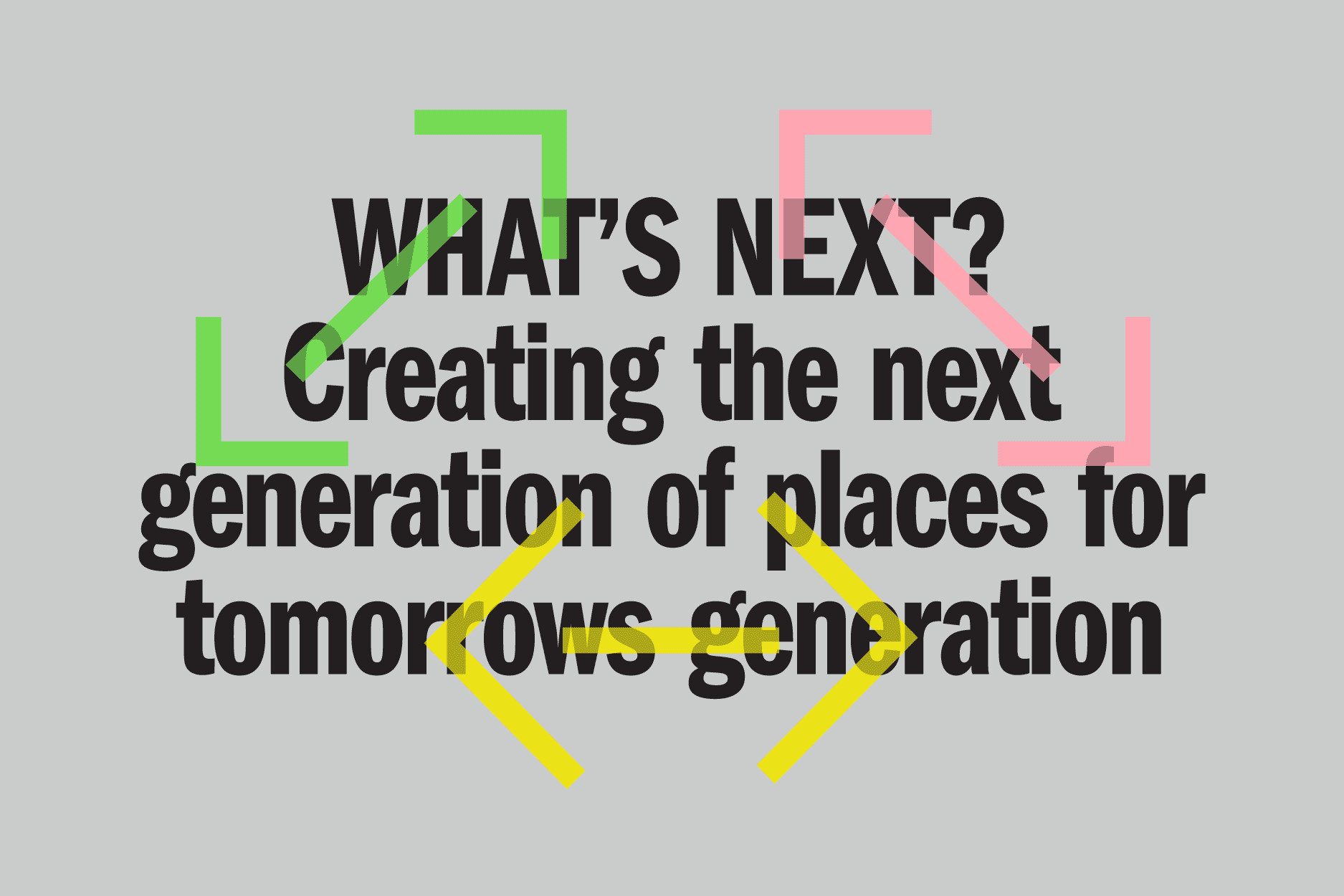
The new brand and visual identity by Studio Ongarato for international design studio Hassell was launched in 2019 following extensive strategy and positioning. Remodeling what the architecture firm stands for and challenging the conventions of architecture and design norms, the new brand reflects the evolution of Hassell from a traditional architectural practice to an ideas-led ‘Design Firm of the Future’.
With a long-standing relationship of almost two decades, Studio Ongarato worked closely with Hassell on the rebrand, drawing inspiration from alternative models of being an ideas-led practice and medium agnostic together with Hassell’s renewed focus on producing creative, impactful and connected design.
Founded over 80 years ago in Australia, Hassell’s expertise in architecture, interior design, landscape architecture, urban design and planning has seen it expand internationally with 10 studios across Asia, Europe and America.
“To create a design firm of the future, models outside of the architecture domain were explored for inspiration in creating something new and distinctive,” explains Ronnen Goren, Strategy Director of Studio Ongarato.
“It wasn’t just about considering what architects and designers should do, but how they operate collaboratively, adapt and evolve to create impactful designs that people love now and, in the future,” added Goren.
Tasked with redesigning the visual identity across all touchpoints including the identity, logo, website, digital assets and art direction including photography and video content, Studio Ongarato created a unique brand with a strong visual impact, reflecting Hassell’s evolution from architectural practice to a future-focused design firm.
“The new brand identity responds to the fast-changing digital landscape, placing people and their experience at the heart of what Hassel does,” says Goren.
To differentiate the Hassell brand and move beyond the notion of conventional architecture, Studio Ongarato prefaced a symbol over a logotype, an unconventional approach for the architecture industry.
Fabio Ongarato, Creative Director of Studio Ongarato says of the logo design, “We live in a time where we increasingly communicate through icons and symbols. Reinvention in the digital age calls for modern simplicity with identifiable symbols taking on greater significance.”
Reflecting an approach relevant for many media modes, Ongarato says, “the universal and simplified logo acts as an app icon or a television watermark, creating a strong visual symbol and language which can be applied across the brand.”
A single typeface and iconography were used to ensure a recognisable voice, with the extensive colour palette inspired by media primary colours of screen red green blue.
The result is a unique and forward-looking brand which celebrates diversity of voice while ultimately being one design firm of the future.
Project Contributors
Digital and programming by Carter
Tone of voice by XXVI