LOULOU
Loulou’s visual identity reimagines Parisian tradition with an assuredly Australian contemporary appeal
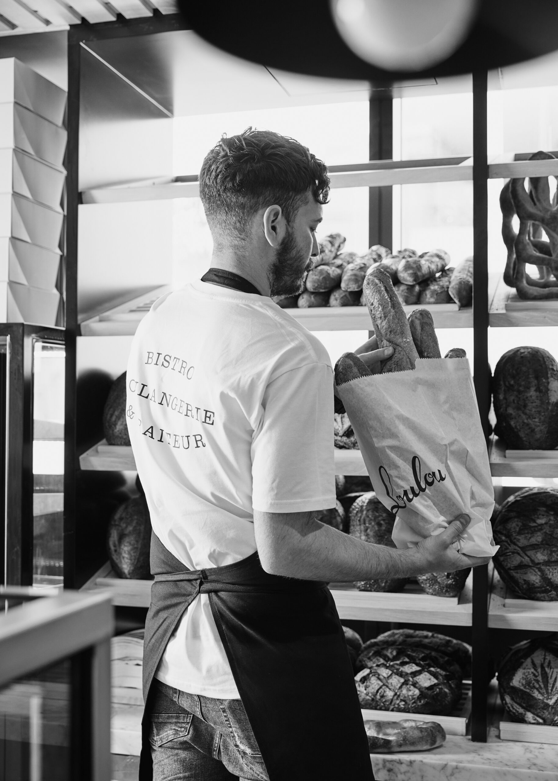
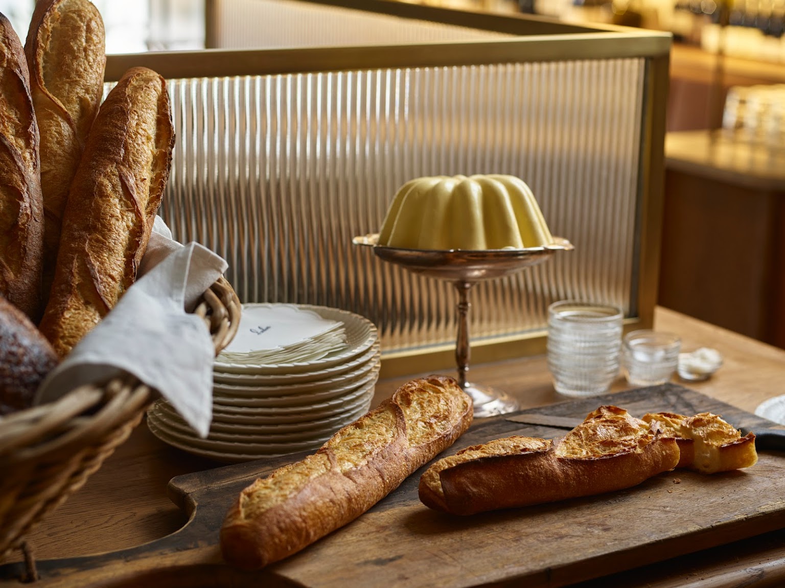
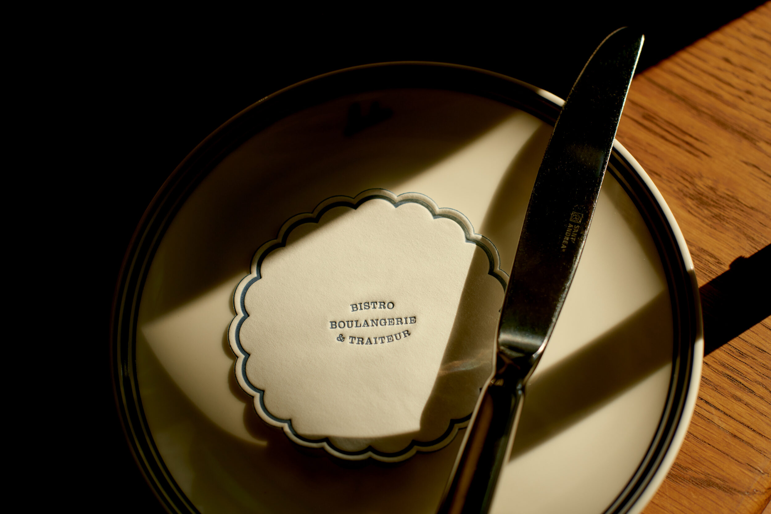
Loulou is a French cafe, delicatessen and bistro set in Lavender Bay, Sydney, with a menu philosophy of classic French dishes reimagined for a Sydney palate. Designed by H&E Architects, the space is designed to feel sophisticated yet approachable.
Studio Ongarato was engaged to create a name, strategy and brand identity that would span day to night offerings and be flexible across a wide scope of applications. Inspired by classic neighbourhood bistros, Loulou is positioned as a timeless, local community institution.
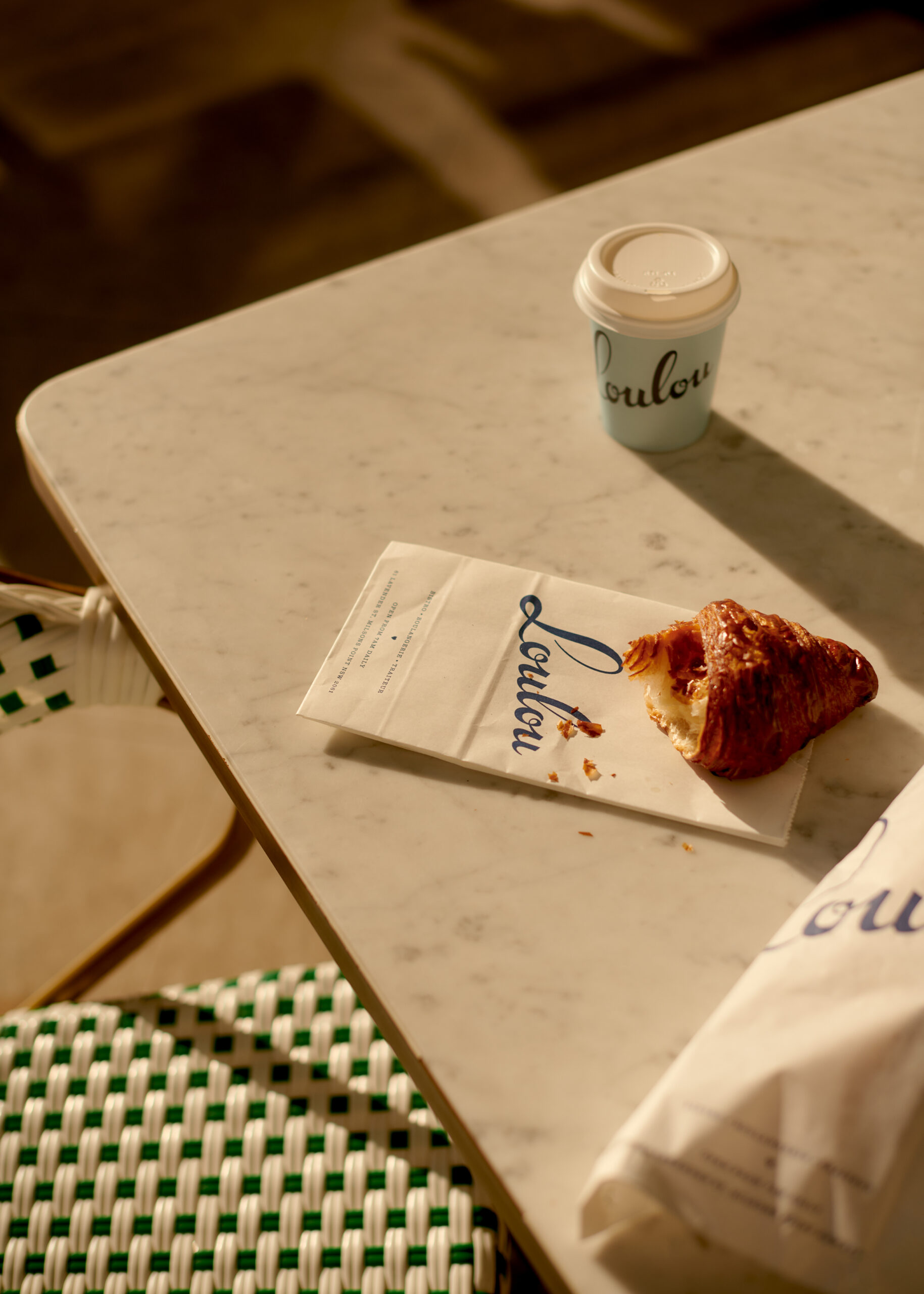
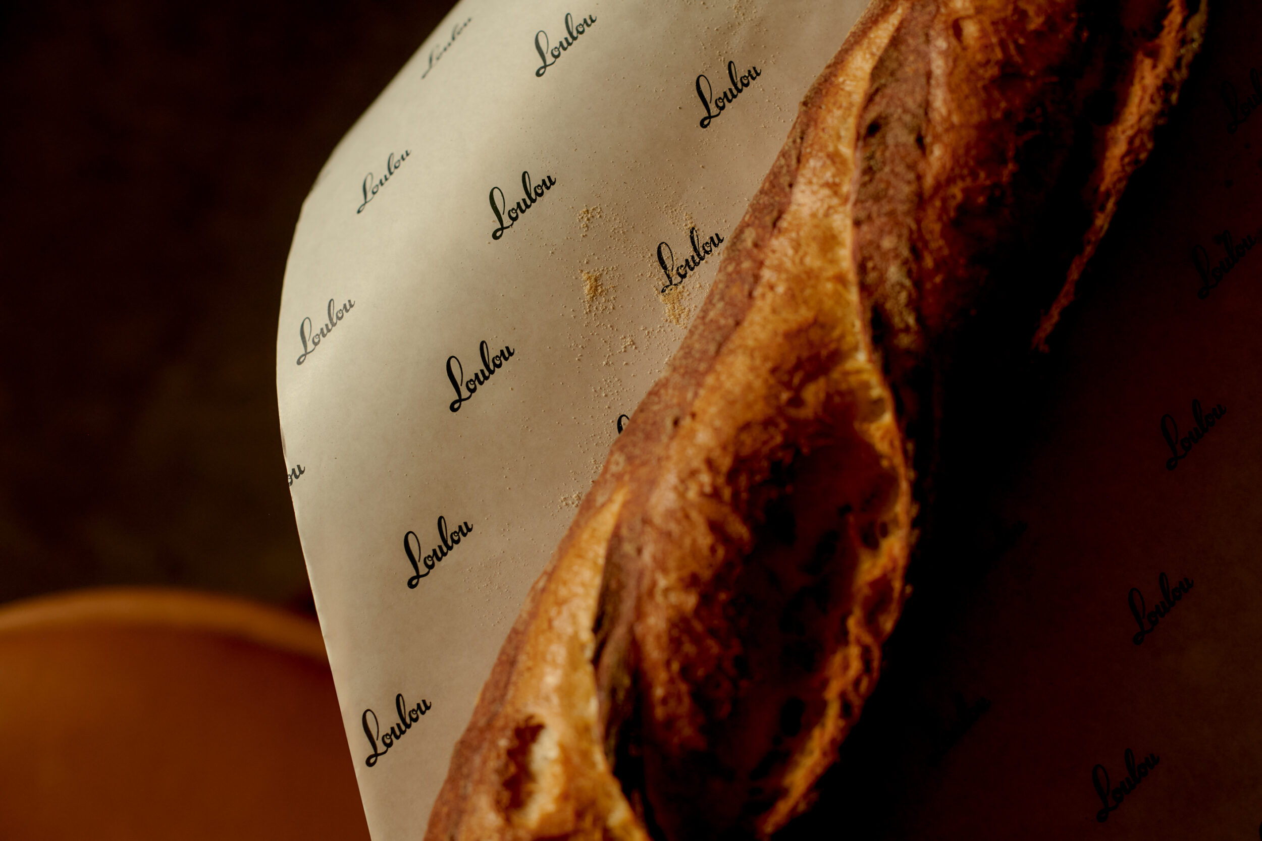
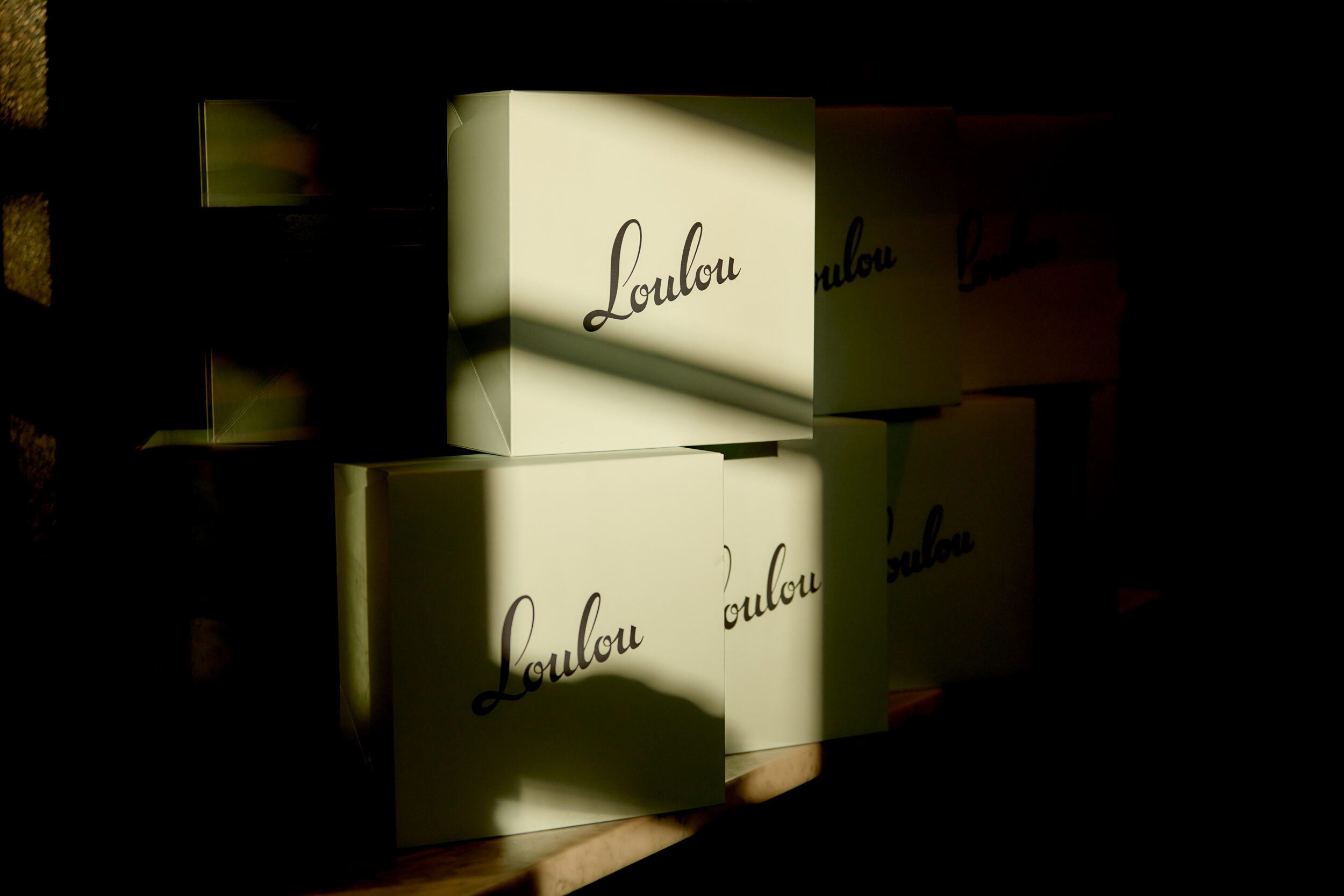
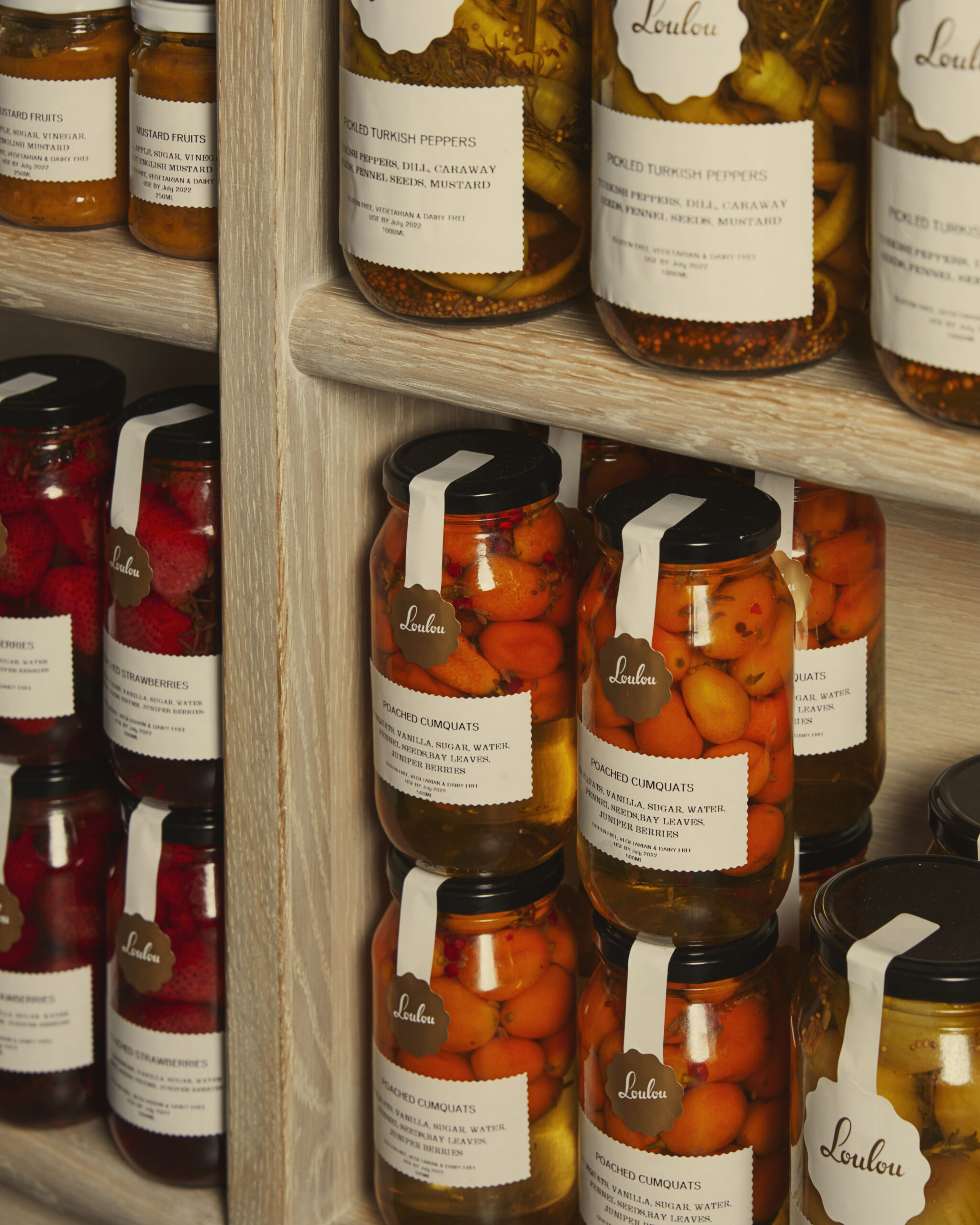
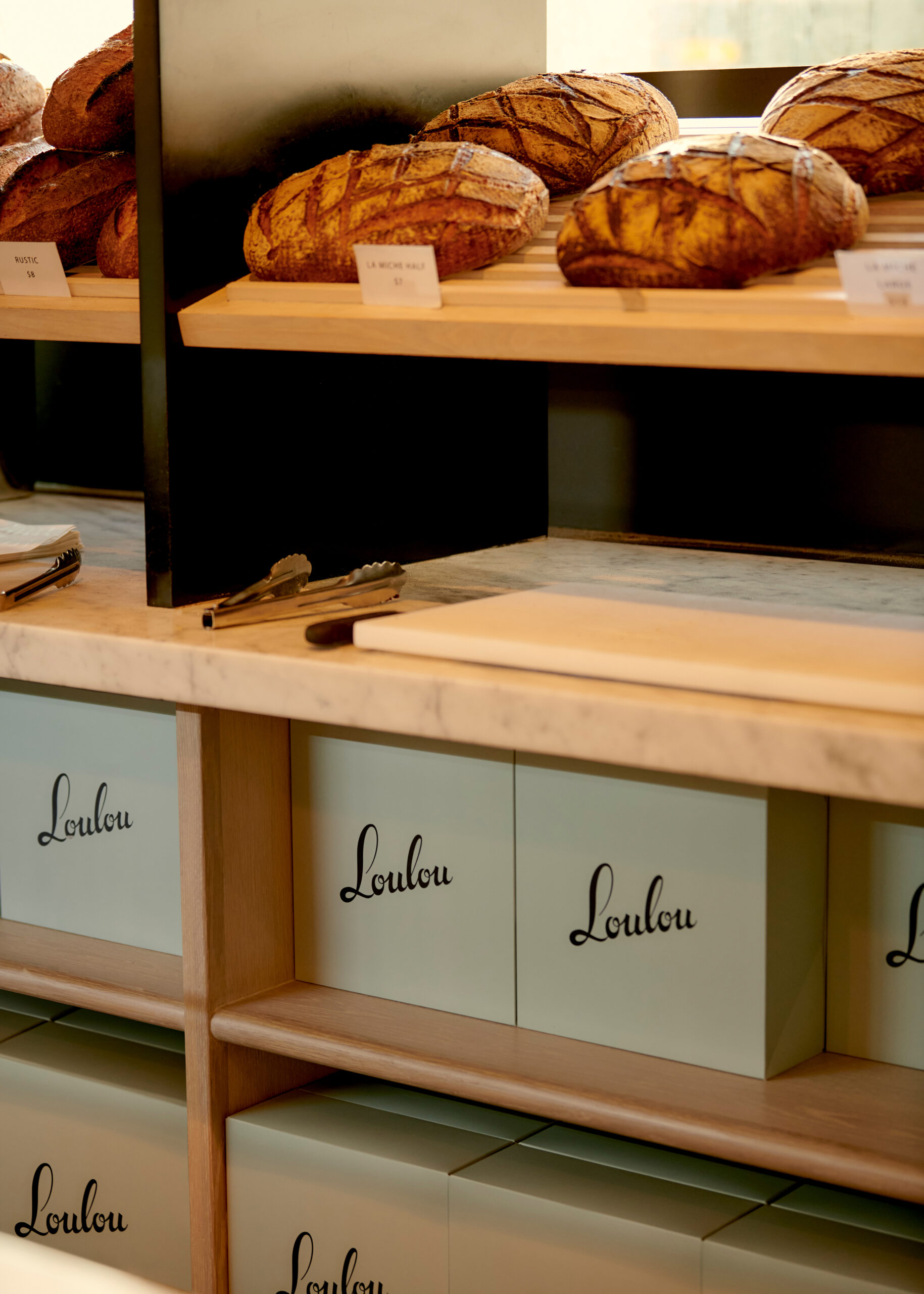
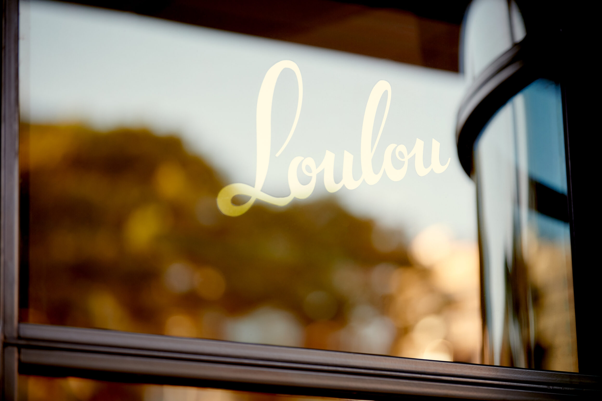
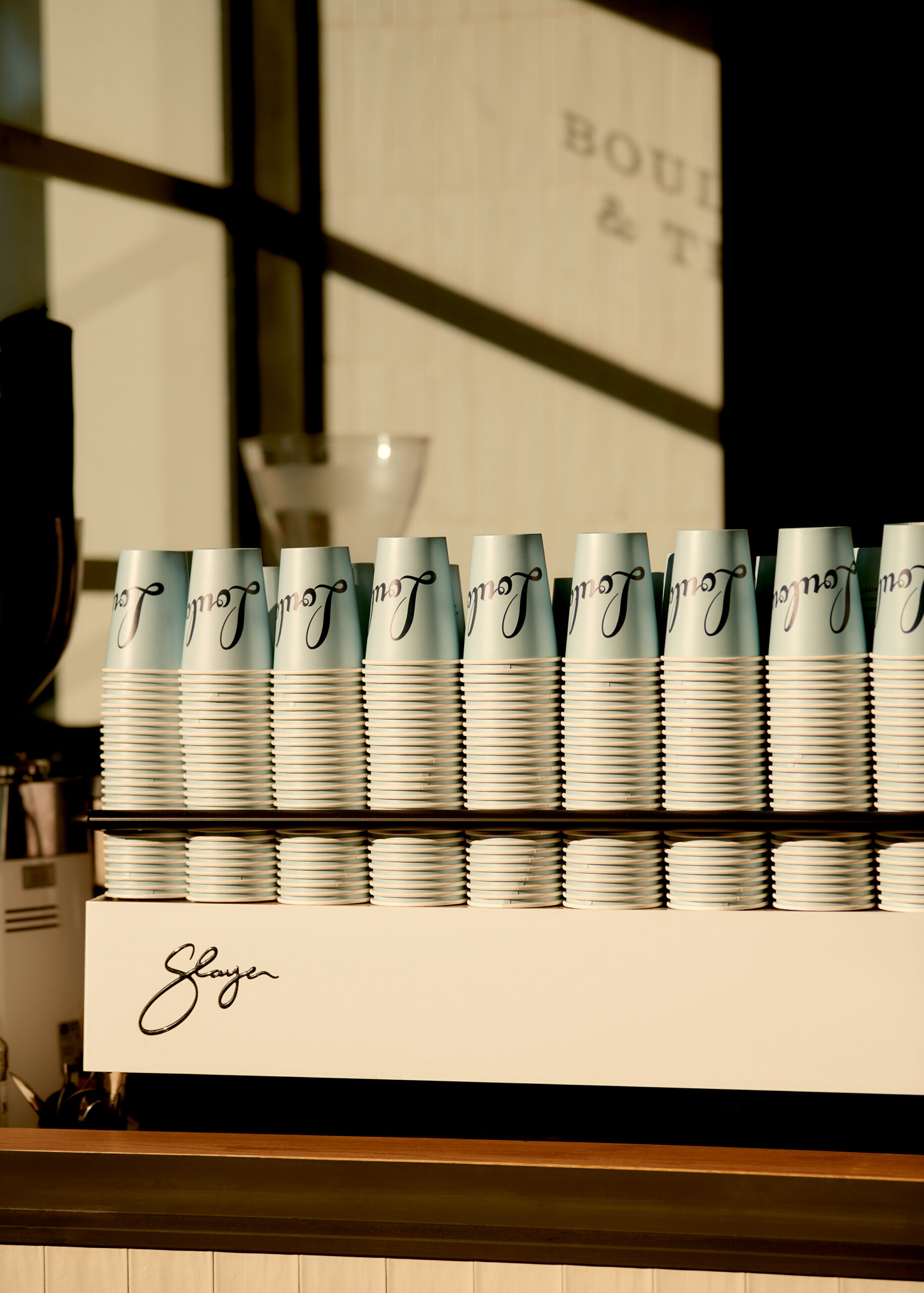
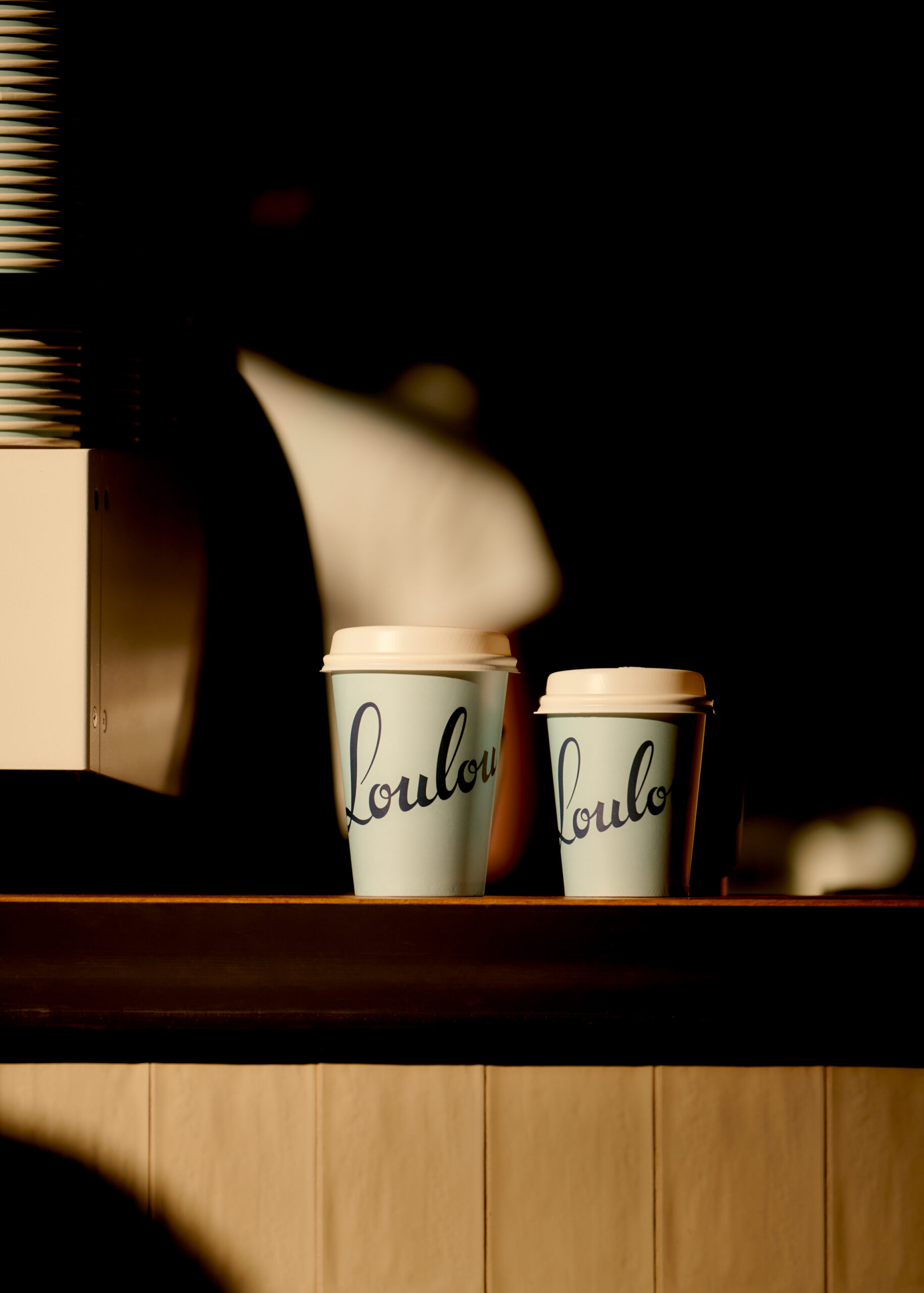
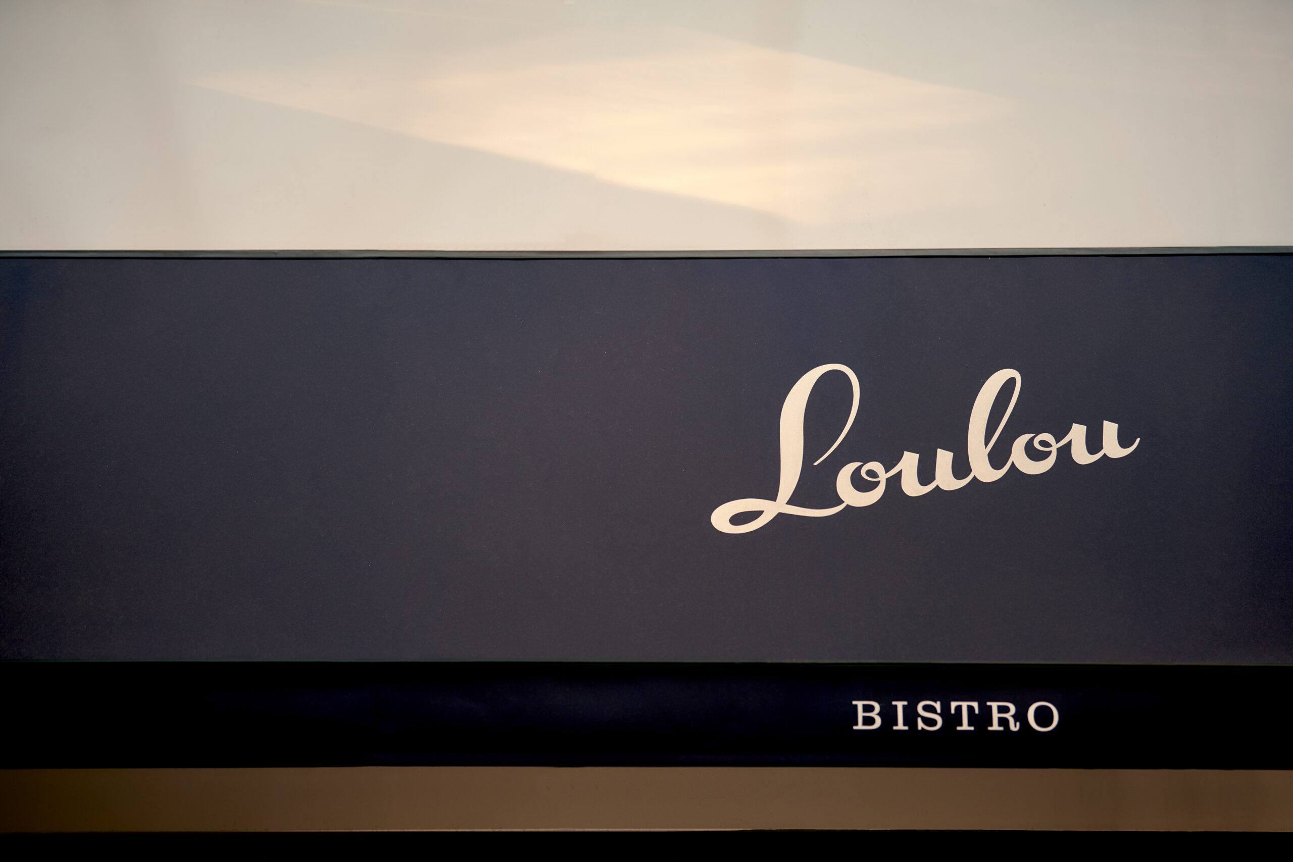
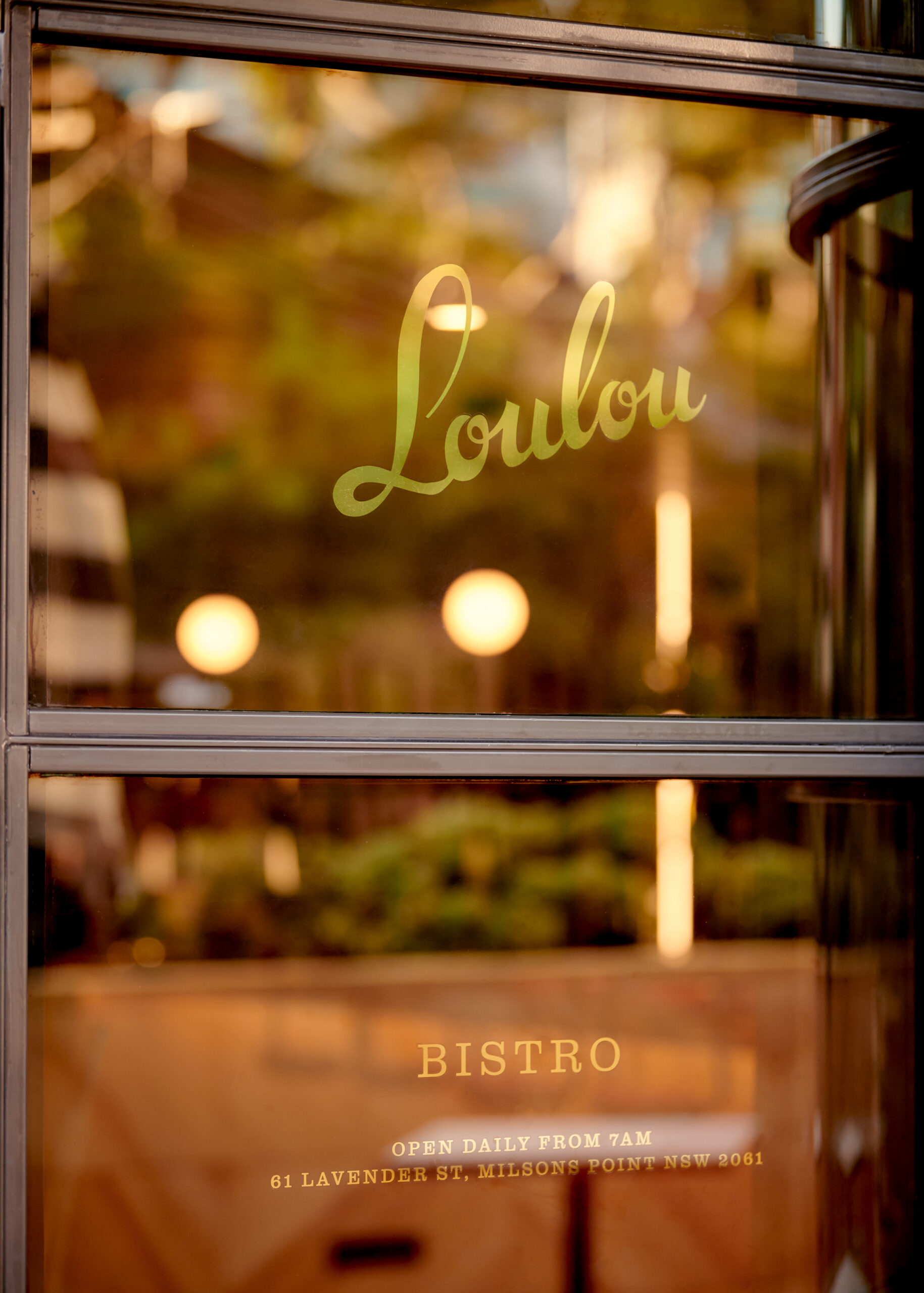
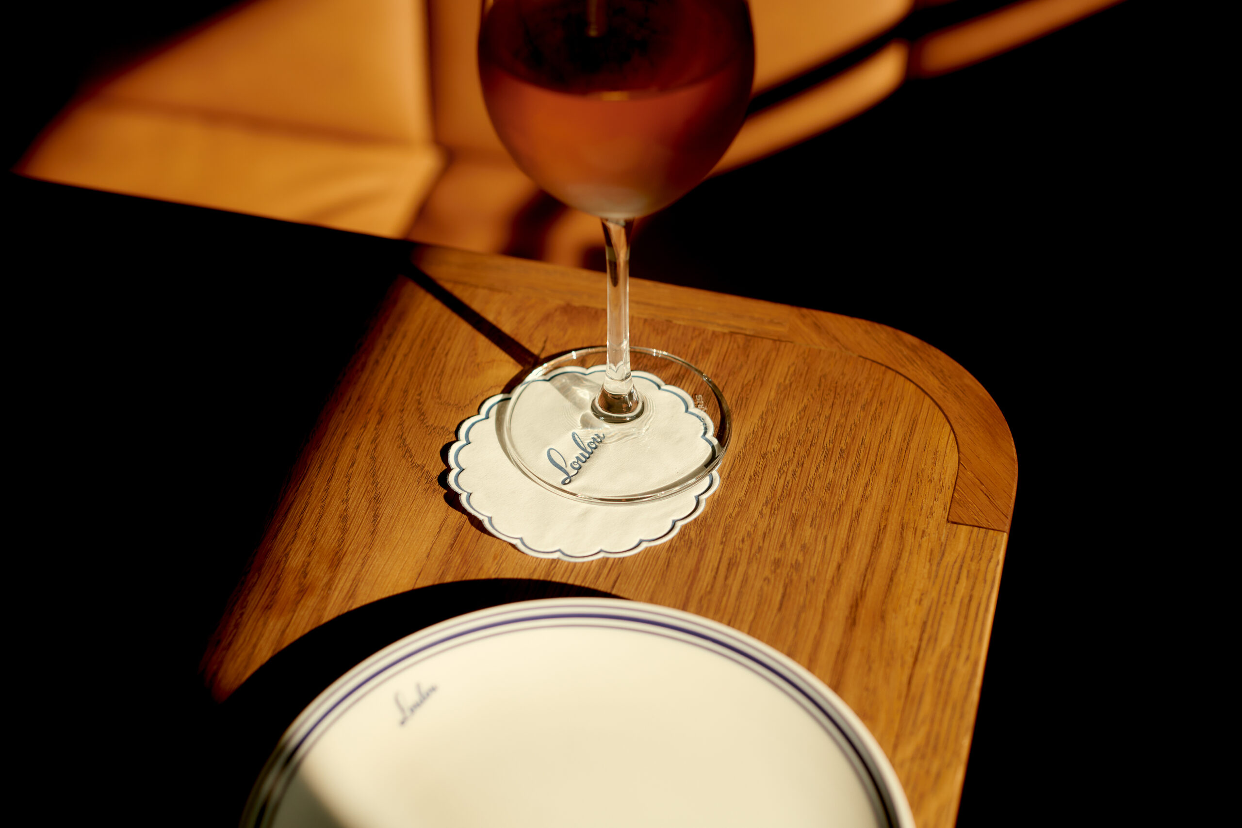
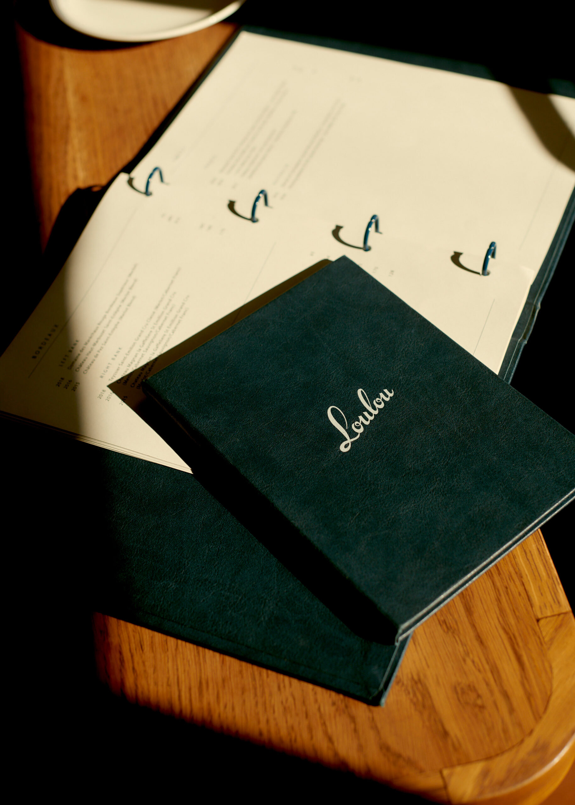
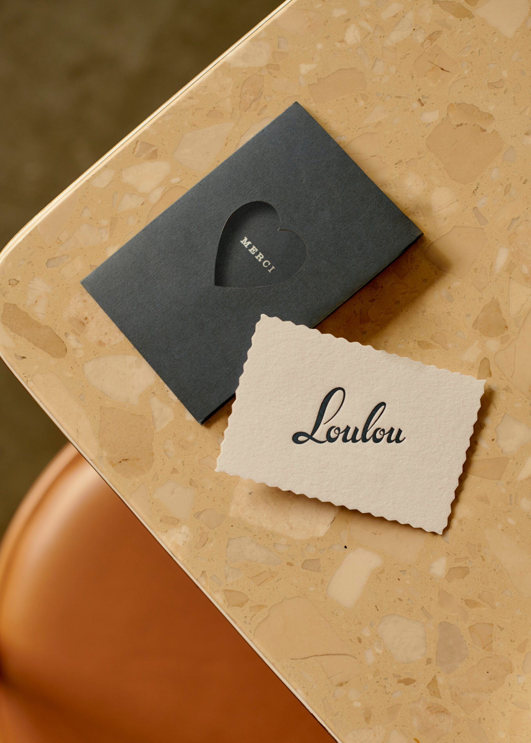
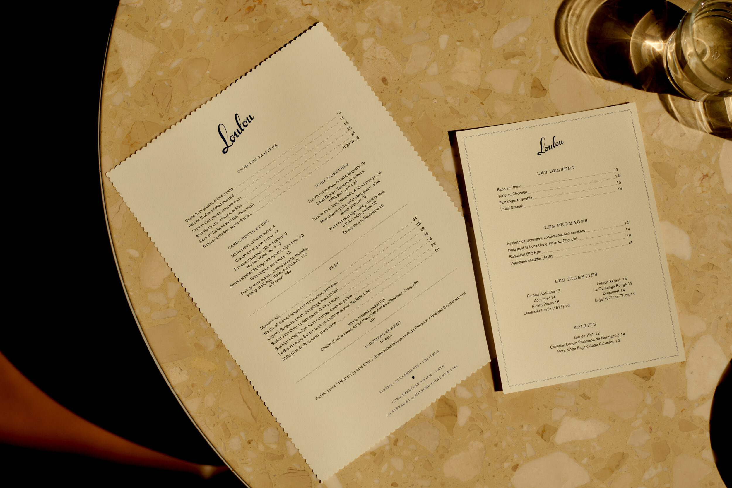
At the foundation is a signature script in the spirit of French vernacular, supported by a secondary heart symbol as a representation of the charm and personality from the name, a french expression of endearment. Colour is an iconic element, used to delineate the traiteur and bistro in a combination of light and deeper tones, maintaining a sophistication between the take away and dining settings. The palette and brand motifs integrate all experiences, including tableware, merchandise and uniforms, creating a memorable impression in each moment .
Attracting a wide generation of patrons, Loulou has a universal appeal and has quickly become a destination embraced by locals.
-
Project Scope
Naming
Brand Identity
Signage
Digital
-
Architecture & Interiors
H&E Architects
-
Photography
Saskia Wilson